Discrepancy Involving Bed Occupancy Data for "Epicenter of the Epicenter" Elmhurst Hospital in Queens, New York
From my perspective, this is a fraud signal until or unless fully explained by officials.
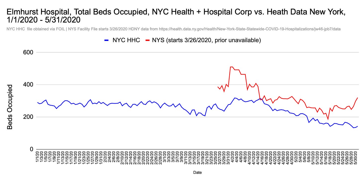
What you see in the figure below I consider a fraud signal.
It’s not proof of a fraud act. It is a sign data or the presentation thereof has been manipulated or distorted, whether by intent or accident, and needs to be reconciled and explained.
Figure 1
Specifically, Figure 1 (above) shows a severe discrepancy between bed occupancy data reported for Elmhurst Hospital in Queens (NYC) in two different files: one published by the state of New York, and the other provided in response to a freedom of information request. The same public agency - NYC Health + Hospitals - is ultimately responsible for the data from both sources, but both cannot be “true,” if they represent the same thing.1
Elmhurst isn’t just any hospital. It’s the hospital described by media and elected officials as the “epicenter of the epicenter” of a coronavirus outbreak. News reports, President Trump, & local officials implied the hospital was overrun & deaths very high.
I’ll confront the Elmhurst death and emergency department data in future posts, but we’ve already seen from monthly totals (figure 10), residential data, and independent photos & video that the Reality Show to which we were subjected in spring 2020 was far more “show” than reality. It comes as no surprise that two sources show two different “realties” about how “full” Elmhurst was with inpatients during the biggest mass casualty event in New York City hospital history.
I’ll explain the discrepancy, potential reasons for the discrepancy, why I consider the discrepancy a fraud signal, and why it matters.
The Discrepancy
The first source involved in the discrepancy is the New York State Statewide COVID-19 Hospitalizations2 dataset, which provides the daily number of total staffed beds and total available beds for each hospital, as reported via surveys the hospital completed and submitted each day. The file starts with 26 March 2020 (the day after the CARES Act was signed). Because earlier data are not available, the true baseline is hidden.3
Figure 2 shows total beds occupied reported for Elmhurst in the incomplete file. I calculated the occupancy by subtracting the “total staffed beds” column from the “total staffed beds currently available” column.
Figure 2
It’s tempting to view the first few days of ~380 beds occupied as a baseline, and the 34% rise to a peak of 510 beds occupied as a sudden rush of patient admissions during a disease outbreak. However, without data from earlier in the year, at least, we really have no idea what to make of it, or whether the levels showing in late March and early April are unprecedented - or high as compared to earlier in the year. We also don’t know if the levels shown for May-December 2020 are normal or below normal, even though they’re lower than the “emergency” period.
Dissatisfied, I submitted a request to NYC Health + Hospitals Corporation (HHC), the agency that operates Elmhurst and 10 other public hospitals in the city, plus five skilled nursing homes. I asked for the daily number of staffed & occupied ICU beds and staffed & occupied non-ICU beds between 1/1/2016 and 3/25/2020. (I requested the rest of 2020 in a follow-up request.)4
HHC granted the request for occupied beds but denied the request for total staffed beds, giving the same unacceptable excuse they later gave for denying death data for 2017-2019:
Your request for staffed ICU beds and staffed non-ICU beds for the dates in question is denied. Data reflecting the information you request is stored on a legacy software system. In order to produce that data would require the coding of new programs, and thus would require creating a new record in contravention of the requirements of FOIL.
There is no good reason for data from a public hospital to be locked up in a digital black box, but having daily number occupied beds back to April 2016 at least provides a historical baseline and is better than nothing.
Figure 3 shows the combined ICU and Non-ICU total from 4/16/2016 through 12/31/2020, graphed alongside the state’s data. To reiterate, the blue line is the data obtained via public records request directly from HHC; the red line is the state’s.
Figure 3
Two things are obvious from this graph:
Either the red line and the blue line are not representing the same things OR the red line is a distortion of some kind.
If the red line is representing something different from what the blue line is representing, not having the data for earlier in 2020, let alone for 2016 - 2019, it raises questions about what is being hidden and why.
Let’s return to Figure 1, which “zooms in” on the first five months of 2020.
Do the “missing” numbers for January 1, 2020 - March 25, 2020 hover around the 400-bed line, with some variation, or is it closer to 300? We don’t know. Much depends on whether the red and blue lines are reporting the same things.
Even if they are not reporting the same things, the difference between data reported for March 31 and April 1 is too high to be ignored. As shown below in Figure 4, the state file shows a one-day, 31% increase (122 patients) in occupancy. The biggest one-day increase shown by the HHC file is 11% (29 patients) between March 30 and March 31. This is a significant disparity that demands an explanation.
Figure 4
The HHC occupancy data is roughly 60%-80% of the state data for most of the spring 2020 period (Figure 5). The files are in 100% agreement on one day - April 16, 2020 - with both datasets showing 307 beds occupied.
Figure 5
In essence, these datasets are telling two different stories about how full Elmhurst was. The story reported to & by the state (red line) shouts “DISASTER!! WE ARE NOT FINE!!!” — just like simulation specialist Dr. Colleen Smith was saying in her New York Times video. The story shown in the data obtained directly from HHC (blue line) says, “Everything’s fine. We’re all fine here now…situation normal/below normal.”5
Which story is true?
I asked the state about the discrepancy last year but never received a response.
My inquiries to HHC about a related discrepancy also went unanswered.
Whatever the reason for the difference, it’s the “red line” data that was (and still is) presented to New Yorkers, media, & officials. Looking at the rest of 2020 in Figure 6 below, the impression we get about Elmhurst occupancy from the state’s public dataset is very different from the one we get in the data I received via FOI request.6
Figure 6
But Which One’s Right?
Which dataset do I think is correct?
I suspect they could both be misrepresentations but I consider the data I received directly from HHC to be more trustworthy overall because all of 2020 is shown, plus 3.5 years prior, and because I asked for and received specific bed types (ICU and Non-ICU Acute).
According to a state profile, Elmhurst has 545 beds total. The chart below shows the various kinds, but not in terms of ICU/Non-ICU.7
One possibility is that the data HHC sent to me doesn’t include psychiatric, maternity, or neonatal beds, but the data in the state’s file does. Notably, Elmhurst has a 94-bed secure prison ward for female inmates who require psychiatric care for acute mental illness. I assume (but don’t know for sure) those beds are included in the 177 psychiatric beds and/or are part of acute bed occupancy.
Because prisoners skew younger, and New York reported a concerning number of deaths among working-age adults in spring 2020,8 it is reasonable to wonder if the “red-line surge” (if genuine) involves an influx prisoners being sent to Elmhurst and/or moved within the hospital to “COVID ICUs.” Prisoners (or mental health patients already in the hospital, who tend to skew younger) being used to create the appearance of an outbreak emergency would be a crime.
Patients moved within the hospital, or suddenly being transferred from one of HHC’s five skilled nursing facilities, is also a possible explanation for the one-day 122-patient increase between March 31 and April 1 the state’s data and mentioned previously.9
Why “Fraud Signal”?
I have no experience in the risk management business or any other industry where fraud signal has a specific, technical meaning. I’m using the term broadly to say, “something obviously isn’t right here and it looks like data was presented in a misleading fashion.” I’ve said numerous times - most explicitly in The F Word - that I believe the 2020 New York City daily all-cause death curve is fraudulent or manipulated, i.e., it is a distortion in magnitude, timing, or both.
I characterize the Elmhurst bed occupancy discrepancy as a fraud signal not only because the differences between the datasets are so glaring - and one is incomplete - but because there has been no transparency about what actually occurred there and I have faced much resistance from both the public agency that oversees the hospital and researchers associated with it - when it comes to obtaining basic taxpayer-funded data.10
It’s also curious that - besides being the day the state’s incomplete dataset starts & the day after the CARES Act was passed - March 26, 2020 is the day NYC Health + Hospitals announced the system had finished a 2-year transition to the EPIC patient record-keeping system.
The timing seems rather fortuitous and like a tidy built-in “Potential Future Excuse” for data errors should HHC (or the federal government) correct or issue a mea culpa about numbers reported in the biggest mass casualty event in the history of any U.S. city hospital system.
Who Cares?
A big reason to care about the Elmhurst occupancy data is because the state’s hospitalization dataset is missing a baseline for ALL hospitals in New York (see figure 1 here). I focus on Elmhurst in this article because it’s the hospital for which I was able to obtain the occupancy baseline and historical data, but occupancy data for every facility going back to 2016 (or earlier) needs to be released immediately.
An even bigger reason to care?
The Elmhurst Hospital Spectacle was used to extend the U.S. federal government’s “15 Days to Slow the Spread” directive and make the world think New York City was being assaulted by a coronavirus (in the Corona health district of Queens, no less).
From that perspective, everyone has an interest in full disclosure of all data, an independent review of patient records, and the truth about what occurred inside the hospital’s walls and why.
I’ve shown this discrepancy previously but did not explain it at length because I was hoping to receive a reply from the state to my inquiry about it
Initially called the Hospital Electronic Response Data System (HERDS) Hospital Survey: COVID-19 Hospitalizations and Beds. The title changed on 4 Nov 2021, which I doubt was unintentional. Dataset description & data dictionary here. Data does not include patients that were treated and released from an Emergency Department.
I asked for the data through March 25, 2020 because I initially thought the state data was legitimate (i.e., file started March 26, 2020 and I simply needed the baseline). When I received and graphed the April 2016 - March 25, 2020, I realized there was a significant difference between what HHC sent me and what the state file reported and subsequently requested the rest of 2020 from HHC, which they sent without resistance.
Yes, this is a Star Wars allusion — although the situation was not normal or fine in this scene… :)
I’ll address the early March “dip” shown in the HHC data when I post an article about deaths at Elmhurst. Timing shown in this thread.
See data in this post and this thread.
The possibility of a substantial number within-hospital transfers of existing patients to COVID ICUs is supported by the HHC time-series data disaggregated as ICU and Acute Non-ICU, shown here.
I'm in awe how you, Ms. Jessica, keep all of this straight and are able to speculate as to multiple explanations to account for multiple possibilities. Your record-keeping is crucial….
I found this article that may amount to so much blah, blah, blah, but am sharing in case it may have some value somehow:
https://www.tandfonline.com/doi/full/10.1080/15309576.2016.1197133
"Coping with Complexity: Internal Audit and Complex Governance"
--------------------
TYPO alert: More than one way to fix, but there's some sort of syntax problem in this sentence:
A big reason to care about the Elmhurst occupancy data is because the state’s hospitalization dataset missing a baseline for ALL hospitals in New York State and city (see figure 1 here).
Jessica can you get hold of data on bed linens, how their usage is accounted for, who cleans them etc? I’d assume that cleaning of sheets is tightly regulated, bed sheets in and out of the laundry (whether on or offsite) must be accounted for to ensure proper health and safety rules are followed. Also is it possible that transferring a patient internally counts (temporarily at least) for two beds if the used sheets haven’t been changed/processed through the laundry system? This could be an easy area to manipulate figures.