
Is the Bergamo 2020 death curve more "modeled" than "measured"?
The official numbers still seem implausible


Official statistics for Bergamo Province (Italy) claim that 5,000 more deaths than expected occurred in March 2020. The excess mortality could not have been caused by a spreading novel coronavirus and the event curve appears to be a distortion in magnitude, timing, or both.
One reason to suspect all-cause mortality fraud is that the event spike simply looks more like a model than a genuine mass casualty occurrence. Bergamo - and its “twin peak” New York City - also bear strong resemblance to worst-case / if-we-do-nothing scenarios, such as the one published by Imperial College.

Is it possible that models or projections were presented as reality, reality could not keep up, and prestidigitation of one kind or another was used to pretend an impossible event occurred?

We’ve considered this idea further and what we’ve found underscores the need for the Bergamo death event to be substantiated with clear, verifiable proof in the form of basic death records that the public can access and review.
Assumptions & Background
Despite what the digital era has led us to believe, it is impossible to precisely count how many people die in a specific location on any given day, and announce it the next day. Real-time death reporting can only ever be an estimate, never fully accurate, regardless of cause. This is as true during periods when a normal number of deaths is occurring, as it is during high-casualty events.
The “COVID-19” death tolls reported in early 2020 - such as those in WHO SitReps and those via the Johns Hopkins University dashboard - were based on unproven claims about a new pathogen causing a new disease, theoretical assumptions, and incomplete data.1 These numbers - and the mechanisms used to gather them - should have been questioned by scientists, technology experts, and historians from the start, instead of being taken at face value.
Although authorities around the world acknowledged delays in reporting, they almost always framed uncertainties in one direction - i.e., There are more COVID deaths than reported, or We are missing COVID deaths because we don’t have enough tests. Rarely did they provide context for "normal" mortality, and there was often no clear indication of when each death occurred, nor any way for the public to verify deaths were caused by a purportedly novel and unique illness.
Officials and provisional mortality data also presented COVID deaths as necessarily excess deaths. They never explained whether (or what proportion of) such deaths were among those who were likely to die in the timeframe — and were content to let the public believe that all COVID deaths were excess deaths. And at no point during the first wave of excess mortality (March-May 2020) did officials suggest COVID death numbers could be too high. Whether intentional or not, this was all part and parcel of the elements which came together to create a grand illusion.
Real-Time Reports vs Final Numbers
Building on these precepts, we return to two news reports about deaths in Bergamo that circulated internationally. (These weren’t the only such reports; they are simply illustrative of what mainstream outlets said at the time.)
On March 25, 2020, Reuters reported that “some 1,176 people” had died in Bergamo Province by March 23, 2020. Two days later, on March 27, 2020, The New York Times reported, “And in Italy, the most deaths are in the Bergamo area. Officially, 1,969 people have died there.”
The numbers weren’t just numbers, of course; they were claims about a number of real people who had died. Neither article specified the timeframe for these deaths, the exact dates of death for each individual, or whether these figures were in addition to the expected death rate. Both sources said the actual toll could be as much as four times higher.
For now, we’ll treat these figures as though they refer to total deaths since March 1. According to official statistics for Bergamo Province (population 1.1 million) there were 825 deaths total from March 1–27, 2019, which would make the claim that almost 2,000 deaths had occurred on those days in 2020 around 135% above normal. In and of itself, this was certainly a scary enough number to convince people in Italy and around the world that something very deadly was happening.
But the finalized figure is even more incredible: The Italian Statistical Authority says there were 5,405 deaths from March 1–27, 2020 in Bergamo Province – a 555% increase compared to normal.
The gap between numbers reported in real-time and the final figure - i.e., 1,969 versus 5,405 - is reason enough to wonder whether reality was force-fitted to a model ex post facto. Consider what we’re being asked to accept: that 3,436 more residents died in real life than media were reporting at the time, in a province that typically sees 30 deaths a day.
How such a dramatic increase could occur with virtually no documentation "on the ground," in subsequent reporting, or represented in class-action lawsuits or memorials is not only beyond comprehension but also raises the question, where the ‘four times higher’ estimate come from?
“Four Times Higher” Source?
It appears the “four times higher” estimate came from an analysis by Claudio Cancelli, the Mayor of Nembro - a small town of 11,000 residents in Bergamo province - and Luca Foresti, CEO of a clinic complex called Centro Medico Sant'Agostino.

Describing themselves in a 26 March 2020 article as “two physicists: one who became an entrepreneur in the health sector, the other a mayor” who know each other well, Cancelli and Foresti said outright that they believed “the real death toll for COVID-19” was four times higher than official numbers.
For all-cause numbers, they cite data collected by the Italian National Institute of Statistics (ISTAT), the local civil register in Nembro, and - for the COVID numbers, national surveillance reporting and a Lombardy regional dashboard.
A table shows total registrations from 1 January 2020 through 24 March 2020, and compares the early 2020 daily averages with the four-year historical average. It’s implied - but not explicitly stated - that the graph is depicting deaths per day.


However, given the normal processing time even at the local level, we have to wonder whether the graph is a genuine, versus constructed, representation. We also have to wonder if some portion of the 158 deaths did occur in the period since 1 January, i.e., deaths were above normal before March, possibly caused by undisclosed factors such as seasonal vaccines. The official COVID death number and historical average shown in the table are very close (35 versus 31). Could the green “Covid-19 deaths” line be closer to what verifiably happened, with deaths labeled “Covid-19” simply being those deaths which occurred in the emergency timeframe?
In theory, Cancelli being the mayor of Nembro should mean the municipal data are reliable. Given the insouciance with which authorities at various levels of government in many countries have lied or hid the truth about the ‘pandemic,’ Cancelli’s position as Mayor of Nembro might also be a good reason to be suspicious of the data.
Cancelli and Foresti also showed a table for the city of Bergamo. Because the authors don’t explicitly say they obtained records from the local civil register, we are left wondering whether the data (below) are an estimate derived from the Nembro numbers.

Our interest is in all deaths alleged for each day, but the gap between the all-cause and COVID figures is astounding (and will be explored further in the next section).
At the very least, non-neutral local analysts appear to have been the source of the “four times higher” claim reported by international media.
Contemporaneous COVID Death Numbers vs. Final All Cause Numbers
Considering the number of deaths attributed to COVID shortly after the main event had “ended” (i.e., deaths returned to baseline) further illustrates the point from a different angle.
In a research letter published in The New England School of Medicine on 5 May 2020, three Bergamo doctors - Stefano Fagiuoli, Ferdinando Luca Lorini, and Giuseppe Remuzzi - wrote,
“Lombardy, and particularly the province of Bergamo, has been the area of Italy most affected by Covid-19. As of April 26, 2020, the province had 11,113 confirmed cases and 2,932 deaths from Covid-19.”
How does this number compare to the final all-cause figure?
The graph below shows the death toll in Bergamo province from 1 March 2020, to 26 April 2020, alongside the same period in 2019.
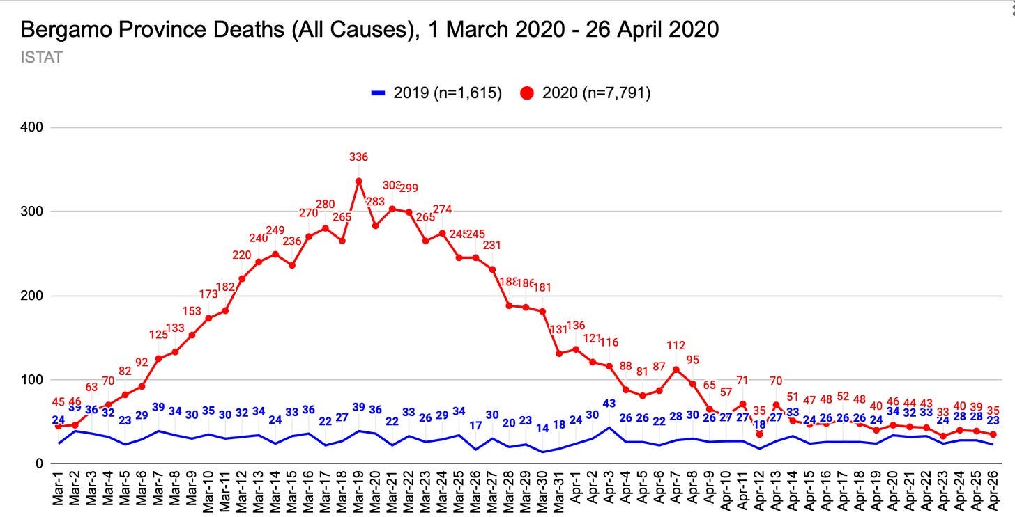
If, as Fagiuoli et al. report, there were 2,932 deaths attributed to COVID-19, it would mean there were 4,859 deaths not attributed to COVID-19. Subtracting the normal death toll from 2019 still leaves a significant portion of the excess deaths—3,244—unaccounted for by COVID-19.
While we recognize adverse health effects and harms attendant to “locking down,” we nevertheless question so many deaths a) not being labeled as COVID-19 during a time when every death possible was being counted as a COVID death, b) occurring from other “lockdown” measures in such a short period.
The high proportion of deaths in Bergamo not officially attributed to COVID-19 raises the possibility that all-cause mortality figures may be exaggerated if only because, in places that reported excess deaths in spring 2020, the number of deaths attributed to COVID often exceeded the number of excess deaths not attributed to it. This pattern is evident in New York City, where close to 75% of the 27,000-death increase listed COVID-19 as an underlying or contributing cause.2
It could be argued that artificially inflating or moving death numbers for a specific period so as to pretend a dangerous virus was spreading should have resulted in more deaths being pinned on the “new” disease. However, the idea that an underprepared, unsuspecting Bergamo was “hit” hard and fast — so much so that people couldn’t be tested and cause of death properly ascertained — also serves the Official Story well.
The Bergamo Mirage?
The proposition that over 6,000 additional Bergamo, Italy residents died in less than two months—almost all of them within one month, and following a curve that rises and falls in a dramatic, highly unusual fashion—should be regarded as an unprecedented, perhaps impossible, death event deserving of thorough scrutiny.
Especially given that no documented "footprint" of corresponding breadth or depth was evident then — or is evident now — it is increasingly obvious that the death spike resembles a statistical mirage: more modeled, or manufactured, than measured.

Verduyn, T. (2024, April 15.) The dashboard that ruled the world. | Neil, M., McLachlan, S., Fenton, N. (2024, May 8). Exaggerated estimates from epidemiological modelling were growing exponentially during the 'pandemic.’
Source: CDC WONDER
 | A guest post by
|
Keep going. The truth will eventually come out.
I noted the use of the verb mesmerised (albeit with a z) in your quoted definition.
Did you know that the word can be traced back to a doctor - and charlatan - called Franz Mesmer, who 'mesmerised' the chattering classes with assorted mumbo jumbo and associated BS during the early years of the Victorian era.
Funny/odd. And plus ca change...
"Despite what the digital era has led us to believe, it is impossible to precisely count how many people die in a specific location on any given day, and announce it the next day."
This statement reminds me of one of my pet peeves. When I used to teach Epidemiology in a Health Sciences University >6 years ago, I always had to wait for at least two years to have any official morbidity and mortality statistics that I could use as "real" examples in class. The "real data" that I used to illustrate concepts in class were always a couple of years behind. Then, suddenly, during the "covid pandemic" we had mortality data reported to us on a daily basis. Nothing to be suspicious...